
Key Redesigns
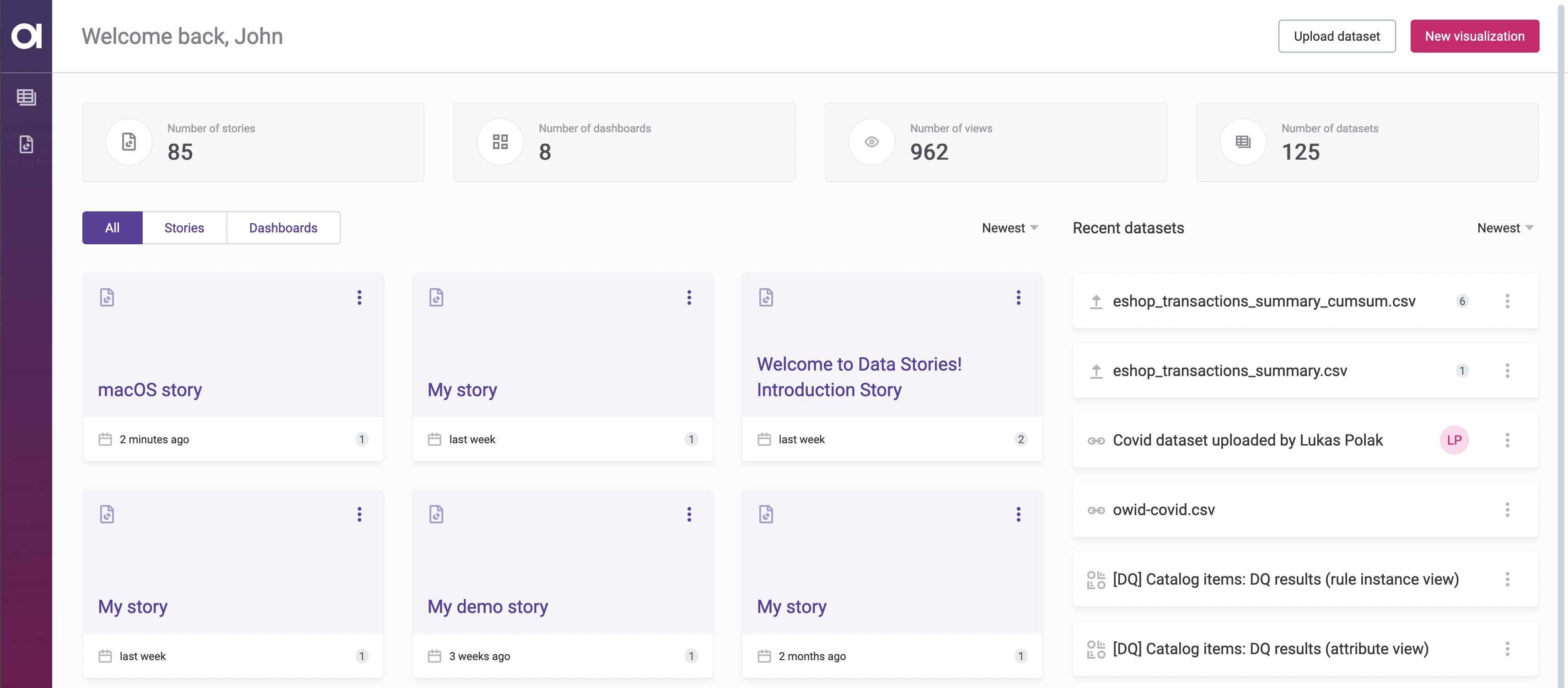
- You can now find all the essential information on the Data Stories homepage.
- The dataset detail page now has a fresh new look.
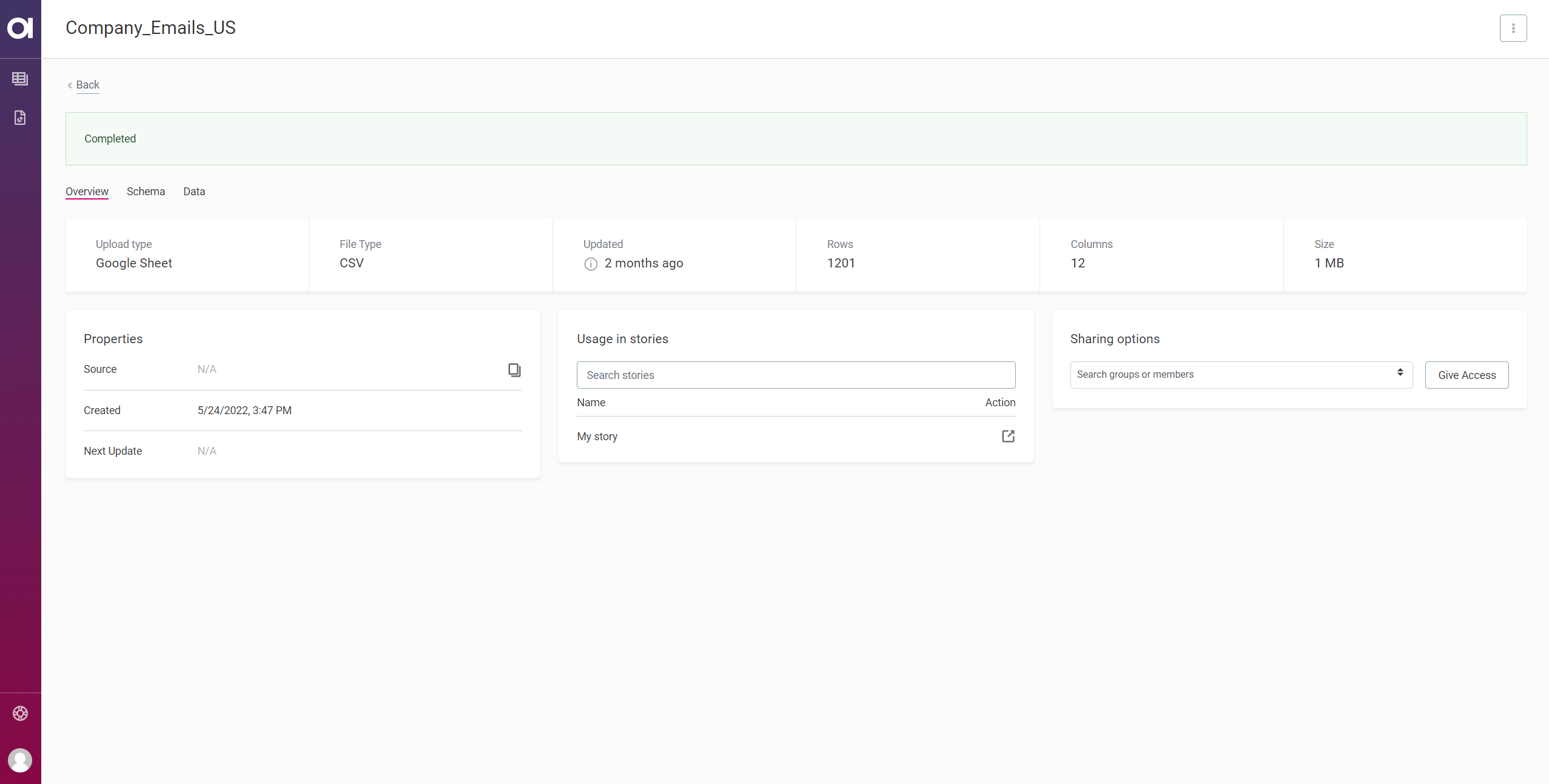
- You can now see even more information, such as the source of your data (if uploaded from a URL) and the timestamp when it was added.
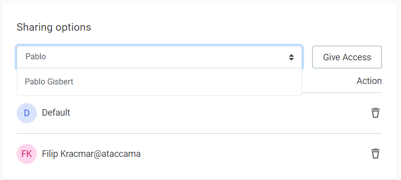
- We added two new sections: Usage in stories, where you can see which stories and dashboards use your dataset, and Sharing options, which lets you share the dataset with your coworkers.
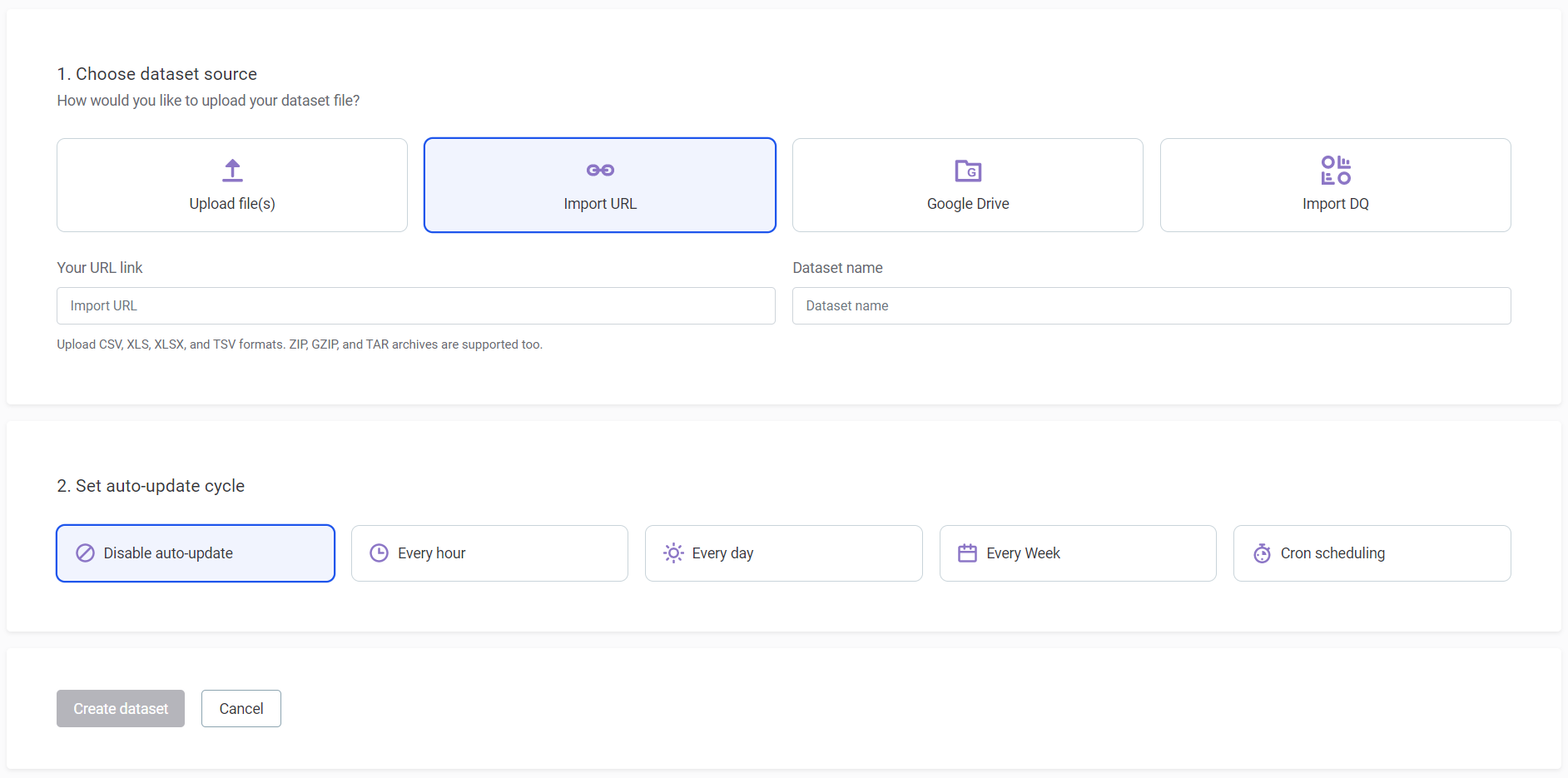
- We redesigned the dataset uploader to make it more intuitive.
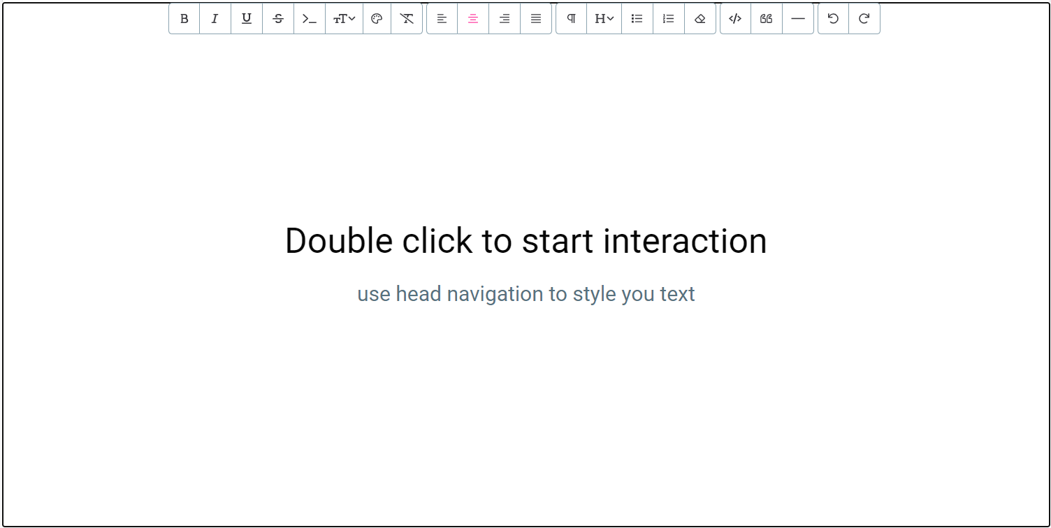
- The Paragraph widget is now called Text widget.
- We added a WYSIWYG editor to the widgets below to make them more customizable:
- Text
- Hero image
- Explainer
- Heading
Story Editor Features
- You can now use cumulative sum as an aggregation function.
- We included a tooltip under the Datasets tab that tells you when the dataset was created and when it was last updated. To see this information, hover over the tooltip icon.

- Width and font size of explainers and insights are now fully responsive.
- You can now use bubble charts to visualize three-dimensional data by adding another category.
Bug Fixes
- Long story titles are now truncated and an ellipsis is added automatically ("VeryLongText...").
- When sharing stories that include an encoded step or section (for example,
§ion=1&step=1), charts below explainers are now correctly displayed to recipients. - Labels are now aligned with their corresponding bars, regardless of the orientation (horizontal or vertical).
- Timeline no longer displays the default color scheme, it respects your custom color selection.
- We fixed an issue that prevented users from interacting with a chart in a section (Stories) containing both an insight or explainer and a chart.
- Aggregations now respect the data type of the column – it’s no longer possible to select Average function for text columns and SUM is the default function for numeric columns.
- We fixed an issue with data selection in Bar multiseries chart.
- We fixed an issue with vertical labels in Line multiseries chart.
- Race animation now correctly shows the current label for a given point in time. It was previously shown as “undefined”.
- Stacking functionality now works as expected when filter is set to rig null values.
- You can now use Boolean values as a dimension.
Bonus Content
See the new features in action: