
Hi everyone!
This week is an exciting one at Ataccama - version 14.5 is out and about! We will be sharing what’s new on the community starting today with Data Stories. So read on to find out what’s new ✨
What are Data Stories?
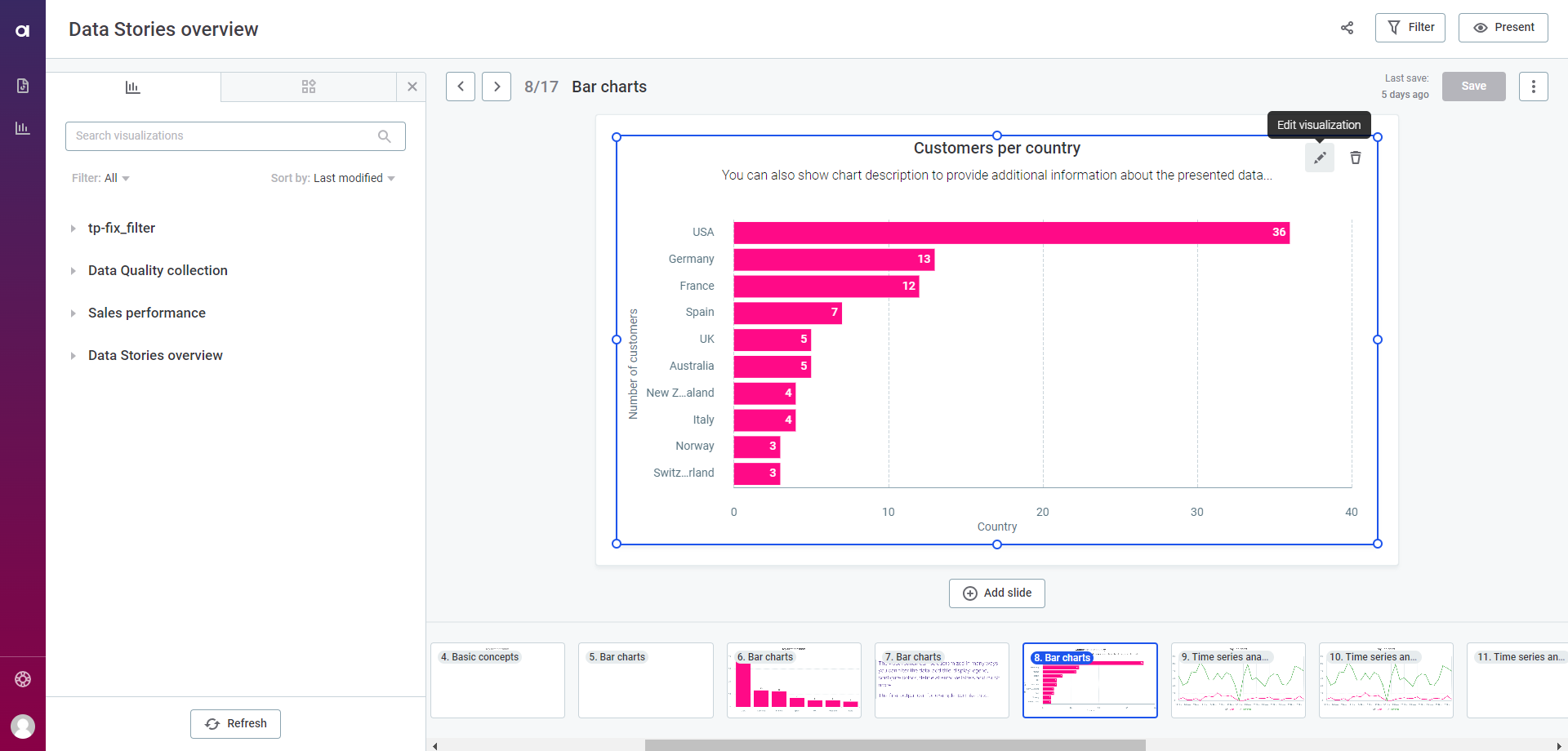
Data Stories is a data visualization tool designed to create, present, and share complex data as dynamic and self-explanatory reports.
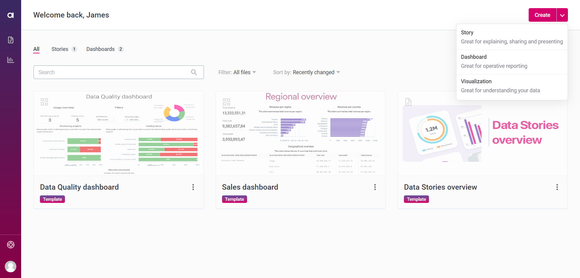
Data Stories offers two types of reports: Dashboards and Stories.
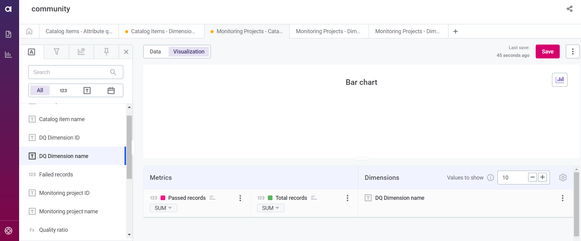
Both Dashboards and Stories have sections with visualizations and static content. While static content allows you to add text, images, or video, visualizations allow you to create bar, line, or pie charts, in addition to pivot tables and more.
You can use Data Stories when you need a tool…
- to create data-driven and dynamic presentations where it’s easy to showcase results, and ideas and display dynamic insights.
- to build dashboards with real-time data which allows stakeholders to understand what is happening at the moment and also to quickly find any answers to potential questions.
What’s new?
📊Enhanced Visualizations
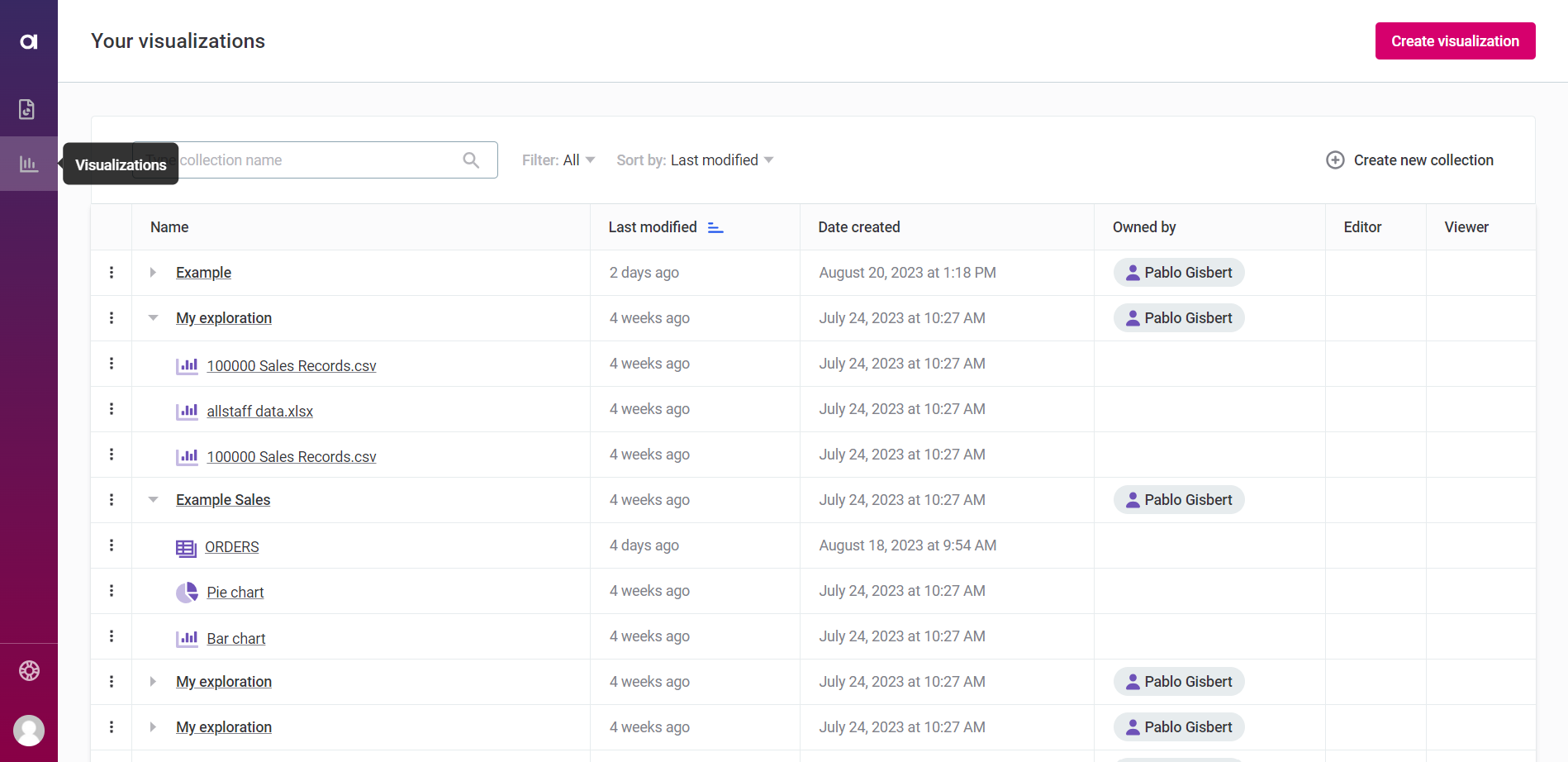
- Create visualizations and share them across multiple reports. Visualizations are now standalone and each visualization can be used in multiple reports. The updated wizard-led process makes it much easier to build, duplicate, customize, or remove visualizations.
- Streamlined user collaboration using Collections. Collections are folders for storing unlimited visualizations that you can engage with or contribute to. You can also manage multiple visualizations at once using tabs and apply visualization-specific filters.
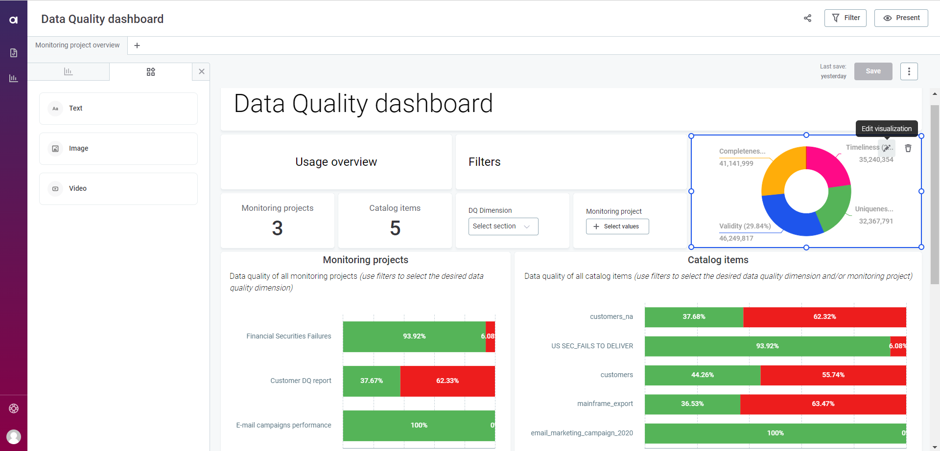
- Build visualizations on top of DQ results and customize your attributes. DQ results are now available in Data Stories! Use them as out-of-the-box datasets that help you assess data quality across monitoring projects and catalog items.
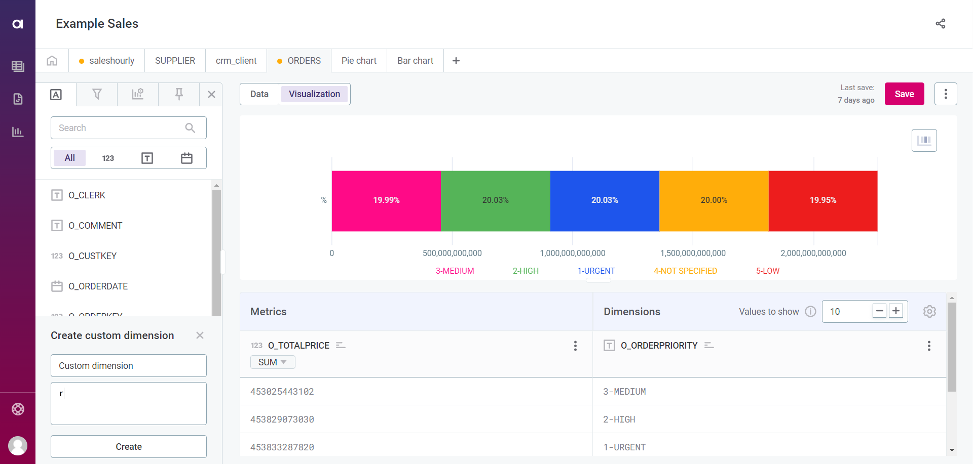
- Improved customization. You can define both custom metrics and dimensions, pin certain values, and formulate custom queries.
📈Changes to Reports
- Revamped Dashboard creation. You can now create dynamic dashboards with an interactive, responsive grid layout, add visualizations, and enrich them with static widgets such as videos, images, and text.
- Enhanced Stories creation. With 14.5 you can craft compelling, data-driven narratives through slide-based presentations, customize transitions, and incorporate visualizations and static widgets.
- Refreshed UI. We have uplifted the look with updated features such as advanced filters and expanded customization options to make creating reports even easier.
🤝 Sharing and Collaboration
You can now control how collections and visualizations are shared through role assignment and ownership. As the collection creator, you are assigned as its owner and can grant or remove roles such as Reader or Editor within the collection. If needed, you can also transfer ownership to another user or group of users.
Another improvement here is you can now share your reports with your team members and other users to increase collaboration and visibility.
📌 New icon on Ataccama ONE DQG suite
Data Stories is now seamlessly integrated with ONE GEN2, which allows to building of custom reports on top of the data quality information.
⚠️ After the the upgrade, your existing reports are migrated, please check out the documentation to find out more about the migration process.
What do you think of the new updates? Let us know in the comments below 👇