Data Stories provides a wide range of charts, it includes also Pie and Donut ones, even though I do not recommend using them, and the same applies to a Gauge chart. Let's look at the reasoning why and why I'd recommend using a (stacked) bar chart instead.
Space usage
In data visualization (reporting, data storytelling) you have limited space you can use. Your task is to fill the limited space with the most value for the end viewer/user. Note, most value does not necessarily mean most charts, sometimes one curated chart is far better than five.
The problem with Pie, Donut and Gauge charts is that they use more space in comparison to an alternative that provides the same value - a bar chart.
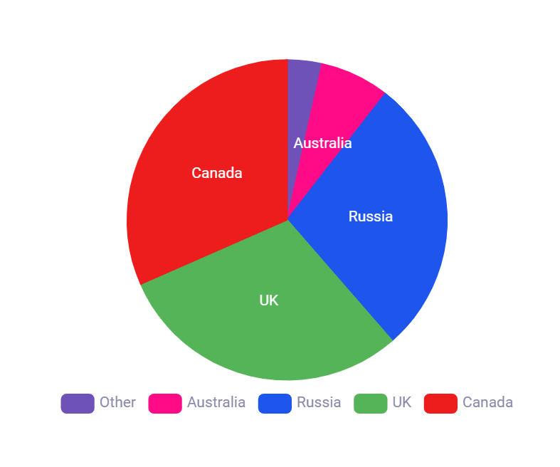
More space is used due to 2 reasons:
- Pie and Donut charts use Area to give value to a single category. Bar chars use just distance. An Area just takes more space
- All these charts are circular, which creates unnecessary space around the chart object
Bellow find a better alternative for the chart above
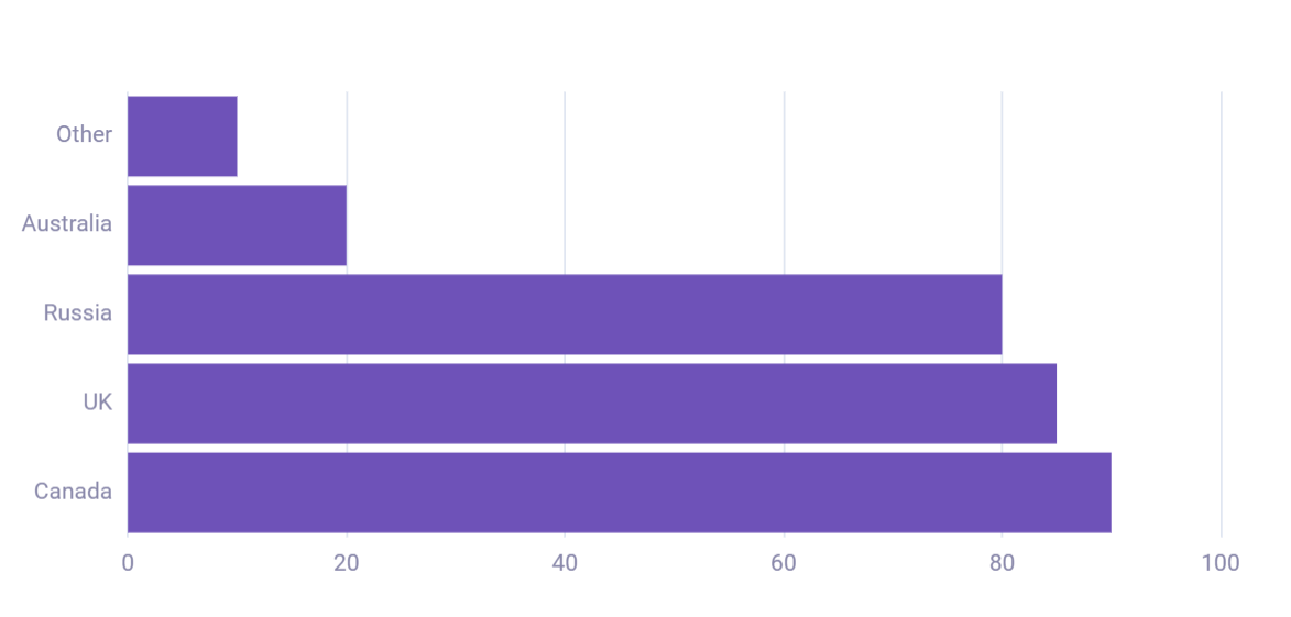
Readability and comparability
The human eye and mind are good at estimating and comparing a distance. However we are not that good at doing the same with the area, it's just more complex as another dimension comes in place.
- As described above Pie and Donut charts use Area (2 dimensions) to give importance to a single category/value, bar chars use just distance (1 dimension). Gauge chart uses distance but plots it in an area
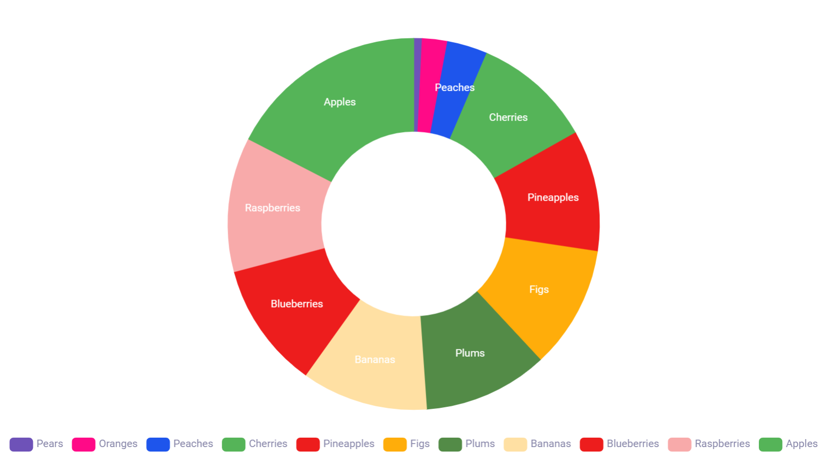
- When categories/values are packed together in these 3 charts, it's not that easy to compare by how much (or how many times) is the second one bigger, not to mention that if there are a lot of categories/values sometimes you can’t even tell which category/value is bigger than the other one.
Common concerns
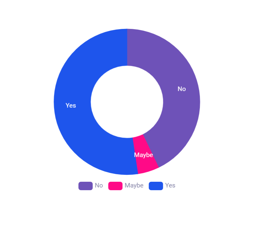
Sometimes people recommend using a pie chart when you want to display percentages and/or a few values. I believe even for percentages and few values bar charts are a better alternative, see charts bellow
What chart/s to use instead?
To substitute the use of those 3 charts I recommend using a bar chart - but which type to use?
There is no single rule as it solely depends on your use case, data and space you have.
When you have a few values stacked chart might be a good pick. When you have a lot of values it makes sense to use just a classical bar chart to allow users a better value comparison
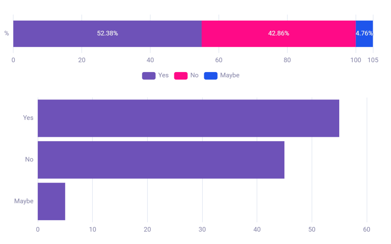
Another reason to select any of the 3 charts is to just use something else as your dashboard or a story is full of bar charts and you just want some different visualization. This is a common issue that is not very often verbalized. I believe using that using the correct tooling is far more important. Also, don't be afraid of boringness, its the other way around, the reporting is then more consistent
Visualization enrichment
Bar charts also allow a much bigger range of options and additional data points to be introduced, enriching the visualization while having the same area.
Probably the best example is an implementation of them called Bullet charts, these provide options to show a comparison to targets and ranges of performance

Moreover, the evident benefit of bar chars is their possibility for sorting their categories from largest to smallest
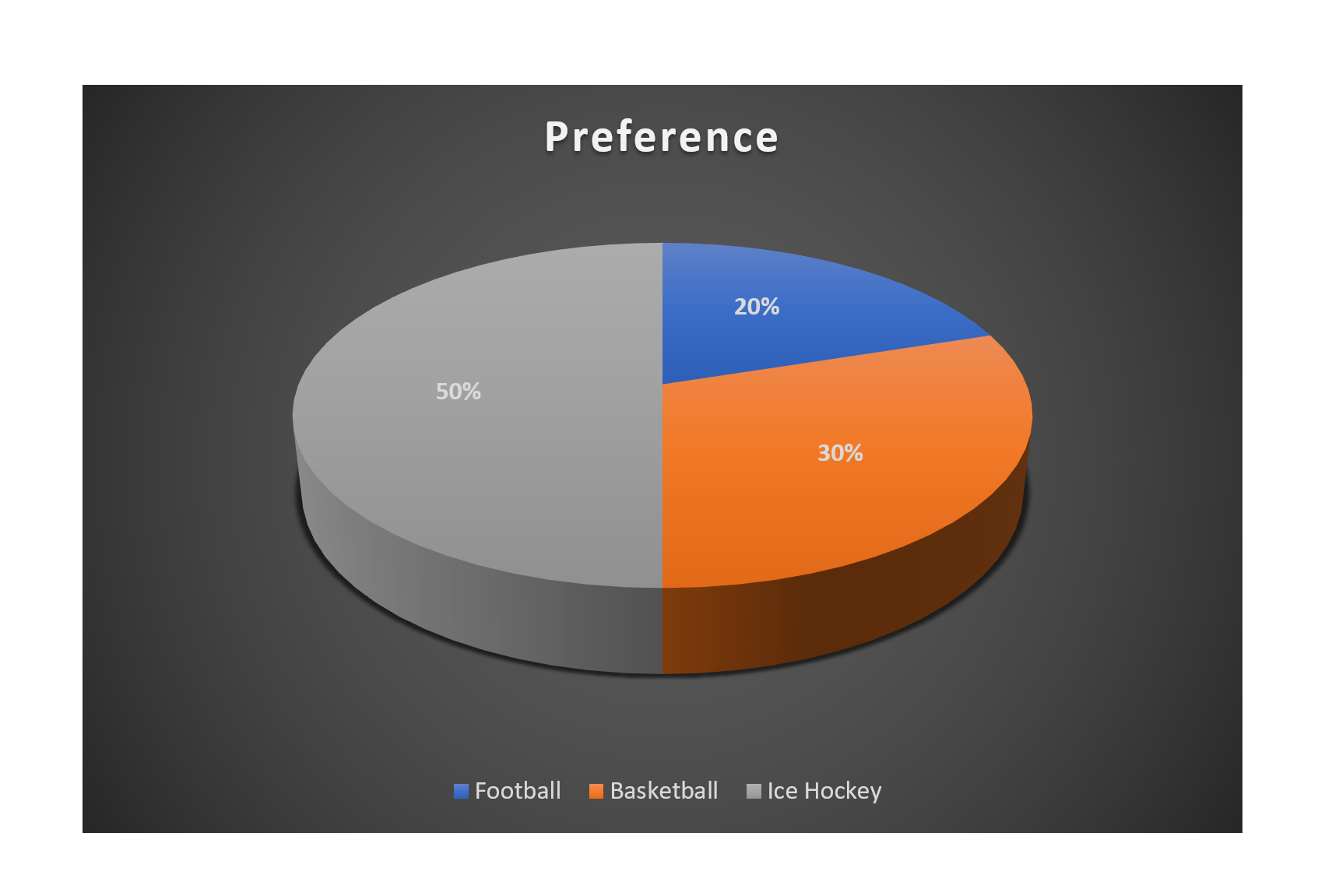
Note that introducing any 3D visualization (created of their 2D version without any additional data points) does not bring additional value, it just increases complexity - another dimension to take into consideration when looking at graph values/categories
Exceptions
No rule or recommendation is carved to stone and sometimes using Pie, Donut or Gauge charts is suitable, one of the examples is gauges in cars
Some of the reasons for using these charts may include:
- We have been left with a square space for visualization
- Users are used to this chart from past
- It would be complicated to create the chart as a bar (i.e. analogue measuring devices)
- Data are in % and only two values are displayed - this allows the user to see data are percental and user can quickly see proportion to 50%
- Additional data points are added, like in the doughnut chart when additional data are put in its middle


