Hello!

Does anyone have any ideas for how to make a welcoming and useful Home page for Data Users coming to Ataccama just for data discovery? All of the widgets seem to be focused on Data Stewards, but the majority of users arriving on to Ataccama for us are looking to find data to work with, so widgets like Tasks, Processing Centre, Notifications, and even the Getting Started ones are just confusing to them. 

I’m looking into making a Report that just acts as a welcome page for those new users, but haven’t been able to make anything that nicely introduces the platform without putting too much in front of them. 

Let me know if anyone’s done something like this before!

Just to give anyone else who may find this an answer, there isn’t anything that can be done. We have used a combination of a few Rich Text buttons, but it’s not great. Using Reports seemed like the right move, but the Data Stories dont scale to different window sizes, and so aren’t good enough for a landing page, while Power BI doesnt allow machine readable text. In both cases, the load time of the Report was way too long even if we could solve the other problems. 
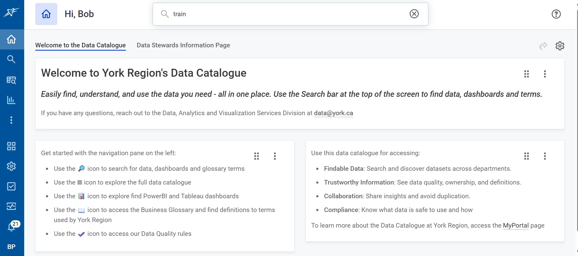
With rich text you can include links, and unicode icons, which make it a little better, but still a rough start for data consumers coming to the data catalogue. I’ve attached a screenshot of what we did for reference. Customer Experience/UI testing found this to be the best we could do with the ootb tools. We are exploring a React App which calls the GraphQL associated with our environment to make something totally custom. 


Reply