


Building upon the excellent work of our Flamingo design team, and a fun gradient ranging between purple and “electric” pink, I like to think that Ataccama looks pretty cool by default. However, we fully appreciate that many businesses have a need to customize their enterprise software to match their corporate brand and identity. This brings us to today’s topic… customisation!
In this post we are going to cover how to set custom logos and colour themes in Ataccama DQG.
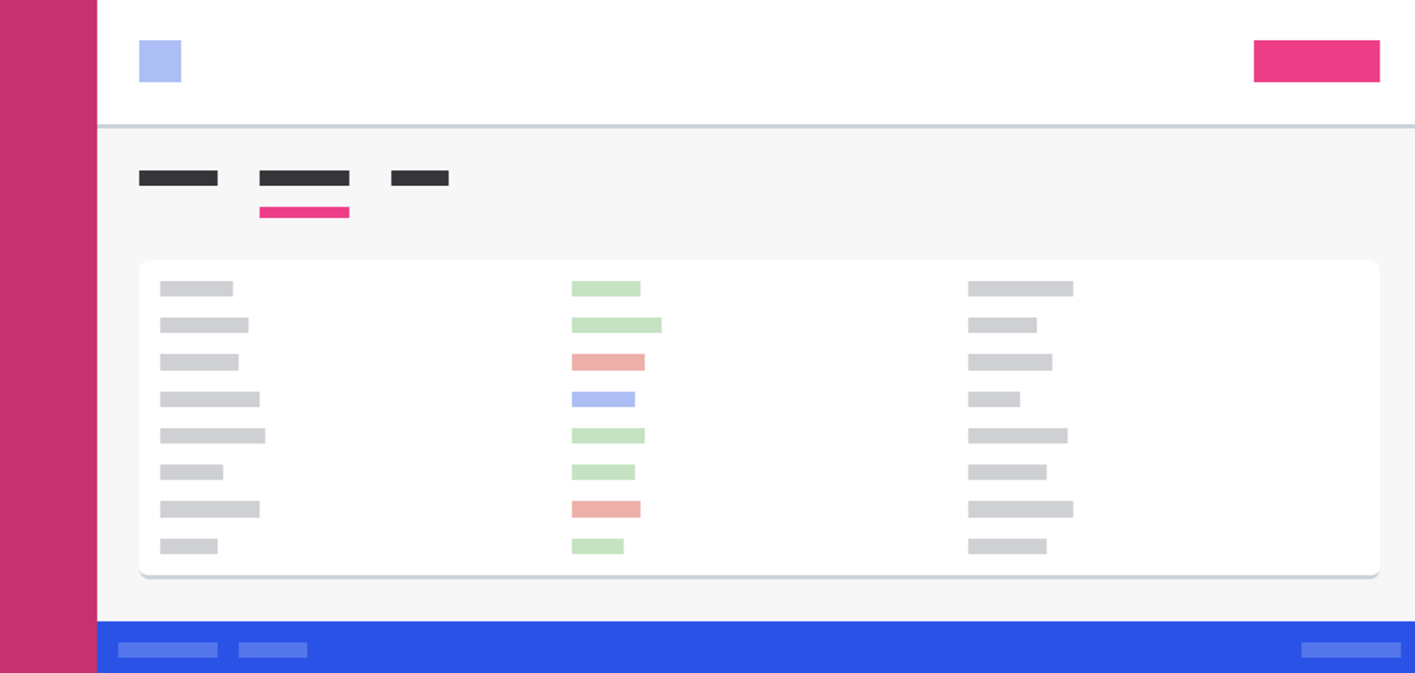
By navigating to Global Settings → Customization, it’s possible to perform a range of customisations in Ataccama DQG. As well as options for custom Translations (pirate, anybody?) and Navigation layouts to reorder and customise the sidebar, you can use the Theme section to fully customise the colours of the UI itself*, aswell as change the top logo to your own.
Indeed, this last feature is as simple as drag-and-drop:

You may have also noticed that this navbar is not purple! Here, we used the “Moon” theme, but there’s many other pre-set options available:
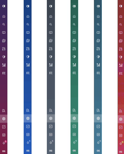
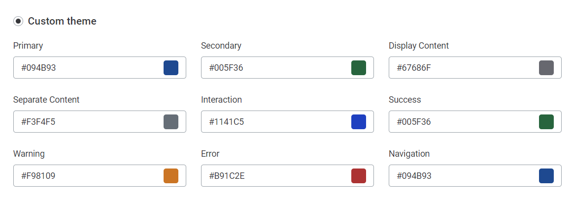
In addition, there is also an accessibility focused High Contrast one for users with limited eyesight (and those in a pinch when asked to demo on an old, fading projector…). But for those wanting complete theming, there is the option to make a completely custom theme, that lets you edit every single colour in the UI to perfectly match your company’s brand.
That's a wrap on custom theming options in Ataccama! Let us know of your favourite designs, or ask questions in the comments 👇
* Themes are set globally for all users of the platform
!-->
